Saturday, September 22, 2018

Ghost Ship


Ghost Ship


Camera                                Sound                               Mise en Scene                               Editing


Camera - the shots and angles 

Sound - the music, script and sound effects 

Mise en Scene - the lighting, costume, setting and props

Editing - cuts, transition and speed

In the opening of Ghost Ship, the film is perceived as a romantic genre. This is suggested by seductive soft sound, slow camera work and slow dancing. The denotations of the singer is that she is dressed in a red dress, gloves and a red lipstick. Therefore, suggesting love. However, the colour red also symbolises danger, blood or pain. 

As the beginning starts to unfold, there are a few suggestive signs that show horror. For example, 'I am so bored' is written in a toy that the young girl plays with. This emphasises that something bad is going to happen, because at this current moment in time nothing is happening. Equally important, the audience has no idea of what the upcoming events will hold.

Camera: Birds eye view - shows the importance of the ship deck
Costume: Red gloves - symbolises her keeping her hands clean, or maybe that her finger prints won't show
Setting: Harsh lines contrast with soft camera movement
Sound: Jolted music cuts
Camera: Long shot - the ship is the central point of the scene, dark setting foreshadows the events
Sound: Eery sounds - unclear echo, sinister, violins. The violins at the beginning are meant to be uplifting/upbeat classical
Mise en scene: Font - for the credits is pink, swirly and happy
Music: Suspiciously slower by the end
Sound: of machinery - ominous sound effects

- The singer constantly stares at the waiter in an off green coloured uniform. After watching till the end of the opening, we begin to realise that she is in on the plan to kill everyone on deck.
- the guests are distracted with the singing, so they don't suspect anything in the upcoming scenes.
- Wire starts with no blood till it slices through the actors, leaving it with blood on.
- Camera moves with the viewer - the viewers point of view - eye view
- moonlight blue fits with the genre


Video Edit

Video Edit


When practicing our editing skills, we used 'Adobe Premiere Editing' to overlap sound onto film (whilst using image effects and transitions in the process). I started to play around with different ideas. As a result, I managed to use the breaks in the film - where the screen goes black - to use different colours to enhance the video; making it more interesting. I purposely chose music that would go with the movement of the dancing animals footage. Dancing animals gave the connotations of something happy and upbeat. Therefore, the music I chose went to match.

Complementary to this, the effects/sound that I used in my first edit were the following:
- Mirroring the middle of the film enabled the viewer to see a zoomed in/focused view of the bears face.
- Black and white effect made the film more engaging for the viewer
- Colour toned the video to strengthen the vibrancy of the video.
- Blurred out effect also showed that although the clipped part of the film was distorted, it enhances the rest.

Premiere Editing


After using Premiere editing to create my video I uploaded it onto my youtube channel in order to make it public. I embedded the link from the youtube share button in order to add it to the blog.  


Monday, September 17, 2018

Camera Shots


Camera Shots

Using a camera we filmed different camera shots in order to get a feel for the type of camera angles we could use when making films or editing. 

Tilt up and down - In this shot you only move the camera
Ped up and down - You move the camera up and down
 Zoom in and out (Lens)
Canted - Camera slanted, tilted (dizzy)
Birds eye view shot
Extra Long shot
Low shot
Eye view
Pan left and right
High shot
Crab left and right - moving
Worm's eye - dramantc
Track in and out
Medium close up
Medium shot
Medium long shot
Long shot


Extra long shot


Sunday, September 16, 2018

Summer Tasks


Summer Task

Task 1 - Audience


The magazine front cover appeals to both a younger and older women's audience, shown through using an image of a women that would be seen as 'pretty' and elegant. People would be appealed to the magazine because they look up to the model, Lana Delrey. She is attractive and the purpose of the magazine is to inspire the reader to 'treat themselves' with the newest accessories and clothes. Likewise, the magazine company are also promoting their clothing line or company.

Using bold and curly font is expressive. The heading presents a girl style magazine due to a soft pink background and bright pink text. The reason behind creating the front cover in this way is because it stands out and clearly shows what it's about. 

Women will feel feminine, whilst urged to purchase their products and have the hair done. 'It's time to play dress-up with your hair', infers that getting a new hair style in fun and makes you feel better about yourself. Lana Delrey is used as a role model and someone to empower the girls. This is clear by the way she is standing. Her posture is strong and is providing the message the writer is aiming to create.

Audiences can often be attracted to the idea of producing magazines themselves, after seeing magazines like this one, because it is easy to read and is straight to the point. A reader may be optimistic about creating one themselves about things that interest them. For instance, a clothing brand such as Topshop may see this front cover and be inspired to create a magazine that portrays what their business is all about and what is important to them. The aim for Vogue would be to make as many new customers as possible or to make loyal customers along the way. If they produce new updates and news about their company, the more likely the brand will be remembered by the audience.
Image result for deutschland 83


Task 2 - Media Language 

Deutschland '83 Trailer

The director's use of camera uses fast moving, short shots of film to create suspense within the trailer. Tactically, they are useful for showing detail and can also be used as a cut-in; in this case, to show key words being displayed - followed by short clips of what the series is about. The purpose behind using short clips as opposed to longer ones, is so that there isn't lots of film being released and revealing what the whole season it is based on, before publishing. Consequently, the director wants to entice the audience into watching the season when it comes out. A powerful trailer will promote the director's work, which can be spread through word of mouth or shared reviews online.

Related image 
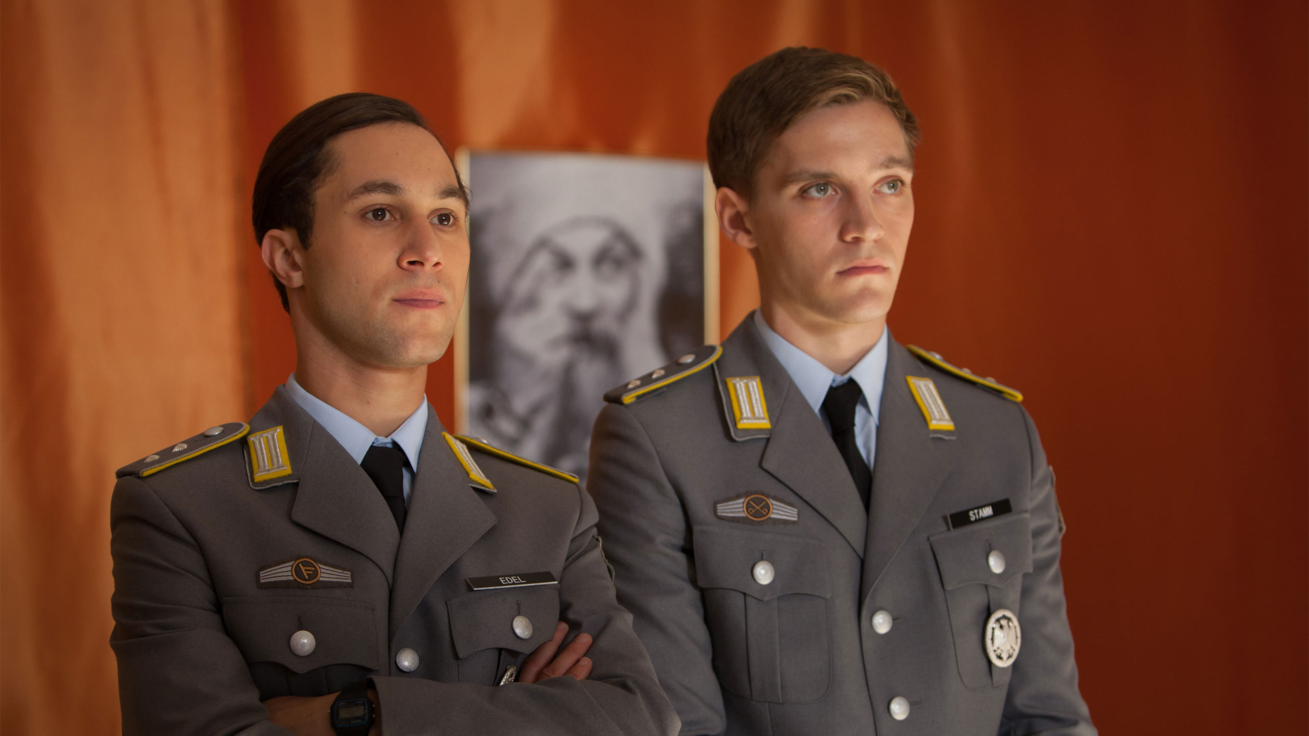
Contrasting to the camera shots used, a key aspect of the Deutschland '83 trailer are the words that advertise the programme. For example, the director uses the following words/dates (in the very beginning): Communist, 1983, capitalist, good and evil, kid, soldier, spy. These words cut up pieces of film. Actors facial expressions are serious and alarmed, almost lost 'inside', which suggests the wars impact. The director has purposely used an unexpected bomb exploding as the song 'Blue Monday' playing in the background. This song is very old, therefore, shows the time period that the series is set in. Each of the aspects that build the trailer up are carefully considered in order to affect the audience. Furthermore, using short camera shots, and pain and drastic events, gives a feel for the drama that the viewers can feel 'apart of' by watching the series. It is full packed and constantly showing a change of events. By changing the events and using the same character, it allows the audience to feel connected to them whilst still be exciting. 

Task 3 - Representation

Media theorist David Gauntlett argues that:
"Popular media has a significant but not entirely straight-forward relationship with people's sense of gender and identity." ('Media, Gender and identity', 2002)


Newspaper front cover

He lied and lied and lied - The Guardian
Portraying a story in the media plays an important role within society. Writing this article means that it can be seen by a variety of social groups who reads The Guardian. However, the newspaper is found to target an educated, middle-class, 18+ audience. It also supports the liberal democrats. 

The Guardian article, displayed on the left, shows an outline of a negative story written in the newspaper. Media has to shaped our views, as a reader, to feel unflavoured towards the person being talked about. 'He lied and lied and lied', uses repetition to exaggerate and convince society a one sided argument. Despite there potentially being truth within the article, the subject has a disadvantage because automatically the readers believe everything they read. In my opinion, the font and size of the text engages the reader immediately - drawing the attention to 'The Guardian', similarly to the heading. This suggests that the guardian agrees with the views of the journalist. 

On one hand, the close up face shot of the man in the image is shaped to present an unfriendly face to influence the way in which the rest of the article is read. Similarly, to the sub-heading 'conspiracy involved wife and daughter'; this quotation suggests that family had got involved. Therefore, leading people to believe the man is careless and has no consideration to whether his family would go down with him after his scandal. 

On the other hand, gender and identity has majorly changed the way in which people interpret the article. For instance, the identity of the man in the newspaper would be destroyed - as well as his reputation. It gives off the idea that the man has been 'named and shamed', with the support from the media. Furthermore, despite this story happening 'long ago', it shows how powerful the media is to bring forward the story.

Vote may or we face disaster - Daily Express

Biased on the Daily Express front cover, the heading is presented as intimidating and emotionally blackmailing, when it says 'vote may or we face disaster'. It is immediately making the audience feel as though they have to vote for the specific conservative party, or the country will have to face some challenging decisions. Whilst not everyone in society will agree with voting for Theresa May, the media shapes people's opinions to see from one side of view. The media is very powerful therefore the wide targeted audience will see The Daily Express supporting this article. This is clear when the writer expresses 'The Daily Express urges you to back the Conservatives'. 

On the other hand, the article uses a close up smiling face shot of Theresa May. Despite the reader not immediately realising anything is meant by this, the purpose is to show a positive image of the runner-up. She looks friendly and wise. Therefore, pschyologically, in the back of your mind you are swayed towards voting for her as opposed to another nominee. The media is shaping society's opinions on how they see politics and the agenda of our country. For those that may not even  vote at all when it comes to who they favour for Prime Minister, the way the newspaper is perceived will have a high impact on the people who read it - meaning the public will be influenced to vote through fear of the country 'facing disaster'. 


Advertising

Are you beach body ready? - Protein World

This controversial advert campaign featuring a model in a bikini was banned by advertising 'watchdog' due to concerns over weight loss claims. The advert asks "Are you beach body ready?" which pressures the women of the targeted audience to lose weight in preparation for the upcoming summer.

It is mainly addressed to the younger adults and shows no diversity within the advert, other than a slim figured, attractive, white model. As shown above, many groups have not been thought of when designing the weight loss advert; such as gender, age, disability, regional identity, ethnicity, sexuality, class/status etc. Someone stated how teenage girls viewing this advert could be extremely concerning as it can be 'demeaning of people, particularly women, and make them ashamed of their bodies' and how they view themselves. Therefore, the advert has come across negative to the audience as it represents ideas of swimwear and bikinis only being acceptable on a certain body type.

Whilst yellow can be used in advertising to portray happiness, intellect and courage. It is also considered to be the colour of 'perfection'. Using a yellow background and bikini shows that the brand is wanting everyone to look a certain way - as though the model displayed in the image is the 'perfect' body shape. Black text also have negative connotations.

Seeing this 'Are you beach body ready' advert in public could really influence the way which people unrealistically view the model - feeling as though that is what every one's body expectations should be. The rhetorical question used in the article immediately makes the audience question themselves and how they look. The bold font used to display this message presents a forceful nature. However, could potentially be the companies way of urging people to try out their brand and products (despite having the complete contrasting affect).


This girl can - Sport England

Contrasting to 'Are you beach body ready?', the advert above shows a completely different approach to encouraging weight loss. It shows you how exercise and determination can give you amazing body results, without the use of products to swap your dietary routines with weight loss tablets. 'This girl can' has an inspiring title supporting the women of the audience that they can do what they put their minds to. This is very different to the opposing advert campaign 'Are you beach body ready?' because there isn't a pressure to be something they may or may not be. 

Demonstrated in the advert is a difference of ability, including disabled people - illustrating how sport is for everyone. The underlining message presents the promising ideas of women being able to do sport without the fear of being judged or told they can't keep fit. It is a powerful and clearly outlines the variety of sports that can be done and there is something for everyone.

'This girl can' is inclusive and more relatable than 'Are you beach body ready?'. Using music also shows a moving, motivating message - expressing a positive connotation.

The image to above uses a clear font, that is bold and literate. It attracts the eye to the advert using white text and is very mutual. When blue and white are used together, it creates a oceanic colour, which matches the girl swimming underwater with white text over the top of the image. Consequently, the adverts overall perspective is free and natural; exemplifying how women should be living a happy healthy lifestyle. Contrasting from the skinnier model figures in 'Are you beach body ready?'.

Task 4 - Media Industries 

The film industry

- What is meant by the 'Bix Six'? 
The 'Big Six' came into being from 1990 to 1995, when Hollywood became more than a distribution and film production. The companies collectively have approximately 80% of US and Canadian box office revenue. They might become the Big five if they collaborate or buy each other out of business. 

- Who are the 'Big Six'?
The Big Six: the 20th Century Fox, Warner Brothers, Paramount Pictures, Columbia Pictures, Universal Pictures, Walt Disney Pictures

- Major media product within the last year:
The 20th Century Fox: Deadpool 2, May 18th 2018
Warner Brothers: Ocean's 8, June 8th 2018
Paramount Pictures: Book Club, May 18th 2018
Columbia Pictures: Hotel Transylvania 3, July 13th 2018 
Universal Pictures: Fifty Shades Freed, February 9th 2018 
Walt Disney Pictures: Incredibles 2, June 15th 2018  


Wednesday, September 12, 2018

Semiotics


Semiotics is the study of signs - anything which stands for something else. For instance, when looking at an iPhone, the application icons are recognized as something else with a name, without being labelled. Similarly, an application with a number and a month written on it clearly shows that it is a calendar. 


The process in which we see and feel about something is detonating and making connotations.

Denotation: What we see when we look at an image (what it is).

Connotation: What we understand from this image (what other meanings it has).


Insatiable is based on a bullied teenager who turns to beauty pageants as a way to make her revenge, with the help of a disgraced coach who soon realises he's in over his head. The front cover for the Netflix TV series is powerful and has semiotics that can be identified.
Denotations:
- She has a crown on her head
- Her facial expressions
- The yellow/orange/red flames are held up to her lips
- The title 'Insatiable' is a bold font in blue


Connotations:
- The crown symbolises a beauty pageant, or something she has won at. She looks confident and slightly arrogant.
- Her eyes have a gazing expression which present ideas of her having a target or being strong minded. It also comes across like she is looking at the viewer, when looking straight at the camera's shot.
- The lighter that is held up to her lips shows and fearlessness. We symbolise fire with pain and danger when we see this on the cover.
- The meaning behind the word 'Insatiable', is impossible to satisfy or someone. It shows that she will not stop at anything which can be presented as obsessive.


Semiotics

Vocabulary


Vocabulary

Liar acronym: Language, Industry, Audience, Representation
Intertextuality: The relationship between texts, including famous paintings, biblical references, music artists that reflect and affect the audience's interpretation of the form of mediaGenre: Type or category of something
Hybrid: Combination of two genres for e.g. romantic-comedy, action-adventure
Semiotics: The study of signs. Also of anything which stands for 'something else' 
Denotation: What we see when we look at an image (what it is)
Connotation: What we understand from this image (what other meanings it has) 
Distinct acronym: Describe In detail, Settings, Themes, Icons, Narrative, Characters, Textual analysis
Fam acronym: Frame, Camera angles, Movement
Mise en Scene: Put on the scene
Aspirers: Seek status, materialistic, orientated to image and appearance
Succeeders: Seek control, strong goals, confidence, work ethic, organisation 
Resigned: Seek survival, rigid, interested in past and tradition
Explorers: Seeks discovery, energy and individualism

Tuesday, September 11, 2018

Genre


Filming practice


In our third lesson, we learnt different types of film genres that can be created. These include: Comedy, Thriller, Romantic, Horror, Action and Adventure, Si-fi, Western, Crime and Mystery, Drama and Musical.

Genre theory - Steve Neale:
- He stated that genres may be dominated by repetition, also marked by difference, variation and change.
- The idea that these genres change, develop and vary as the borrow from and overlap with one another.

Definitions:
Hybrid: Combination of two genres for exmaple, romantic-comedy, action-adventure
Intertextuality: The relationship between texts, including famous paintings, biblical references, music artists that reflect and affect the audience's interpretation of the form of media
Genre: Type or catergory of something

Acronym 'Destinct':

D escribe
 n detail
S etting - location, historical time period
T hemes - love, guilt, revenge, good vs. evil
I cons - significant props (i.e. weapon, wallet, umbrella)
N arrative - how a story is told, plot
C haracters - boy/girl, their background
T extual analysis - style of camera, editing, mise en scene and sound (image, text, colours, characters).

In order to practice and get a feel for a variety of genres, we got into groups of threes and were given two of the following genres. Me, Ella and Amy had Drama and Thriller. Consequently, we put together a short plot - two girls were having an argument over their best friend getting together with the other friend's boyfriend. As the argument gets heated, one of the girls are pushed off something taller than the ground beneath (the drama genre). Then we have one of the girls creeping up on the other behind an umbrella prop at the beginning (this part is thriller); it builds the suspense as to what will happen in the foreshadowed events. As a result, this is the reason we decided to edit the images in this way.

We used aspects of the acronym 'LIAR' in order to create our media. Our media effects the audience due to the fact that they are drawn to the realism of the drama - it is a real life situation. Therefore, enables the viewer to feel connected to the characters or feel sympathy towards them. On the other hand, we used a couple of different camera angles in order to achieve the sort of images we wanted - for instance, camera face angles from both of the girls, zoomed in shots, as well as images with the whole scene in (this captures the type of genre and setting that the pictures are located at). Furthermore, uses the language.


This is the beginning of the story. We chose to picture an innocent girl, sitting alone on a playground. She is smiling which shows that the upcoming events are going to contrast, in order to show the genres.


The next snap shot is closer to the camera and has more focus on someone peeping over an umbrella to create a drastic suspense. It makes the viewers question the character's intention; whether they are good or evil. The images are showing a setting of a present day drama, with the use of the prop of a mobile phone.


The characters clash and cause a 'drama'. Hand gestures and frowning expressions present ideas of argumentative characters. It also doesn't show a one sided disagreement which purposely makes the audience question what is being said.


Amy starts pulling at Ella's hair as things lead from one thing to another. Evil is beginning to show as well as revenge.


Amy uses her prop to attack Ella, but before it does damage she puts her hand out to defend herself. the camera shot angle has changed to Amy's facial expressions to show her thought process - anger. The icon is used as a weapon.


The focus is taken back to Ella in the camera shot to show Ella having more power over Amy, when shoving her. Amy is hanging over the edge of the bench which is building suspense and curiosity to the audience.

This camera shot is in mid-air for the reason that the plot is unwinding and showing what has happened as a result of the arguing.


The end of the storyboard represents the prop on the other side of the scene and Amy sprawled across the ground. This is evil being shown, which contrasts the beginning.


Introduction to Media


 Introduction to Media

Forms of Media

There are many different forms of media that can be expressed; including magazines, news, radio, adverts, social media, television and music videos. Out of the following forms, the three I would use the most are social media, music and radio.

Social media would be prioritised over other forms of media, due to the fact that it enables me to communicate with friends and other people virtually. It is a representation of the things you spend your time doing as well as people you're with - what you wear and things you like. My favourite app on my phone is Snapchat. It is the most used one I have uploaded, for the reason that it allows me to post images, as well as chat to my friends and family. You see the popular trends as well as celebrity news from newspaper articles such as the Sun and the Daily Mail. However, they aren't always true/reliable! It's easy to read. 

Television programmes

As apart of the media lesson, I chose three of my favourite television programs. The Only Way is Essex, Riverdale and Stan Lee's Lucky Man are my favourite for different reasons. One being that they are all based on different genres and stories which makes them even more interesting. For instance, The Only Way is Essex is reality TV and follows celebrities in Essex. Riverdale is an American teen drama about an innocent, small town and how they all react after a rich boy is murdered. Stan Lee's Lucky Man shows what it is like when a police officer becomes lucky after being given an ancient bracelet that gives him lots of power; like the 'ying and yang', with every good luck he receives, something bad happens afterwards to present the balance between the darkness and luck.

LIAR

Afterwards, we used an acronym to indicate the framework of a type of media. We watched links of videos/adverts on YouTube; such as John Lewis and Adidas adverts, in order to illustrate the Language, Industry, Audience and Representation (also known as LIAR) of what the companies were trying to use and target to present their individual messages for their chosen audience. 'Intertextuality' was also a key word we had to look out for within the videos - meaning the relationship between texts, including famous paintings, biblical references, music artists that reflect and affect the audience's interpretation of the form of media.

L anguage
I ndustry
A udience
R epresentation


IKEA
L - Music is bold and the camera shots move quickly. It shows that lots is happening and that the general message within the language used is that education is important and you're praised for things you do well. E.g. waking up early, the young boy got a banner. Doing well is tests, followed by a celebration/party with a piƱata.
I - Ikea advert
A - Targeted audience is for families (especially large ones), race diversity
R - Represents lots of life, happy people. Ikea is benefiting and having an influence on these people who go to Ikea for their services.


John Lewis & Partners
L - Children singing (high pitched) to an older song, based on a primary school play, soft piano in the background
I - John Lewis advert
A - Connecting to the parents in the audience and watching the advert. Children used as a foundation to be filmed due to the fact that in every day life, it is adults who are influencing the younger generation through the experiences they have learnt along the way. However, the message contrasts this because the attention is being put on the children through the form of a play. Which therefore has an impact on the audience.
R - Represents people coming together at a primary school play. Uses children in order to portray what John Lewis is all about - people coming together, having a close bond.


English for beginners
L - humour; for example, when the character says "I love you" on the bus, whilst learning English. It seems as though he says it to a stranger which is funny for the audience's viewing. When he snores when learning. When he pronounces words wrong to his dog - the English views will laugh because they know how it is really supposed to sound.
I - English for beginners
A - Audience for different ages/races/nationalities. Connects to the audience and can be sad for some viewers, for the reason that Christmas time is a holiday spent with family together and he is meeting his granddaughter for the first time and has to learn a new language in order to speak to her.
R - Represents the way old people live, not very busy lives - have time to learn a different language in their own time. A polish man learning the English language in order to speak to his granddaughter at Christmas.

McCain
L - Soft music of a couple and family. Form and language makes it easy to watch. The message of the advert shows that 'Love is for everyone' - everyone is equal and it doesn't matter what gender you are, where you are from, your ability to do something, if you are disabled, your age. It also shows that love stands by you always. Which presents the ways that the McCain business will stand by their customers the way 'love does'.
I - McCain chips advert
A - Audience is targeted at friends and family, all genders or sexualities are accepted. Bring people closer, hence the pictures showing kissing or family relationships and bonds. 
R - The advert represents everyone. The purpose is to show that everyone is welcome and can be used by a wide targeted audience. Nothing matters and everyone is well thought of, regardless of the background that you are from. It is very diverse.


Jean Baudrillard

Jean Baudrillard’s Theory of Postmodernism Postmodernism: The idea of postmodern culture, where there are boundaries between the rea...