Showing posts with label Representation. Show all posts
Showing posts with label Representation. Show all posts
Tuesday, April 30, 2019

Monday, April 29, 2019
Titanium
Titanium
Notes:
- A song by a French DJ and music producer David Guetta, vocals by Sia
- Written by: Sia, David Guetta, Giorgio Tuinfort and Afrojack
- Initially released on August 8th 2011
- Katy Perry was going to feature in the song, however she opted out as she thought the song was too similar to her song Firework
- Music video directed by David Wilson
Overall message:
Not to let something affect you, if someone tries to hurt you be strong and defend yourself.
Themes:
Supernatural, powers, puberty affecting the body and mind, inner strength, adults vs. children, standing up for what you think is right.
DISTINCT:
Setting - school, home, street, forest - American neighbourhood
- Messy and empty house suggesting parents have left the boy and he is alone.
FAM and CLAMPS:
- A levelled low angled close up of a boy crouching on the floor, burying his head which signifies he is scared and vulnerable - sitting tightly could suggest that he thinks nothing will hurt him because he cannot see anything and he is trying to protect himself.
- Long low angled shot tracking in shows how small the boy is compared to the house, suggests what he is up against (in size). Him running outlines his fear and him desperately trying to get out of the situation. He is unaware of how strong his powers are and what he is capable of.
- Close up low levelled angle tracking backwards of the boy on the bike. The boy isn't in the snap shot because it links to how fast the bike is going - shows how desperate he is to escape.
- The end scene is the same as the first (book end narrative), suggesting his is still alone towards the end… The low levelled close up of him crouching, links to the first shot (circular structure).
- Levelled shot, he throws the teddy bear away to show he's leaving behind his childhood - he has to grow up and mature in order to defend himself.
- Vulnerable long shot - woods between the trees
Context:
The Director is influenced by 80s films, despite not living in the time period.
Sound and editing:
G genre - pop
I instruments - guitar, drums
L lyrics - strength, power
E emotion - defending yourself
S screen time - actor is always on the screen, main role/spotlight
T transitions - we follow the boy where he goes - signifies the journey we watch him go through
O order of narrative - school, street, home, forest ...
P pace - starts slow paced, gets faster to show the tensity - slow shots at the beginning to show the emotion (fear) - unpredictable
S sfx
Stop Where You Are
Stop Where You Are
Corinne Bailey Rae (CBR)
Notes and Analysis
- April 2016 the song was produced
- 2006 CBR was a rising star with her hit 'Put your records on'
- Specialises in pop music, a British singer from Leeds
- 2008 her husband died of an accidental overdose. After this she struggled massively with coping with her husband's passing. Therefore, she disappeared and released her newest song in 2016.
- The song encourages people to live in the present and embrace the moments you're in.
- Urban London
- Diversity is shown through gender, age, ethnicity and class
Themes:
Class:- Businessman
- Homeless and less fortunate people
- Poor and lonely, desperate
Gender:
- Male and female shown in similar situations which suggests that everyone is in the same boat and there are men and women that are sometimes forced into homelessness when it isn't their fault.
Age:
- Younger generation - teenagers wearing a hoodie, which suggests they can be threatening because you can't see their face
- Gang-Like look because they're wearing a leather jacket or tattoos covering their skin
- Troubled adults
Ethnicity:
- Black people
- Mixed race
- White
- Asian
How is the artist represented?
- CBR is showing that a bad situation can be made positive and turned around. People shouldn't take things for advantage and appreciate the opportunities they are presented with.
- Her dress is bright red; the colour symbolises pain or love - so the dress suggests the pain she carries around with her, relating to her past love experiences. Which as we know, is what happened when her recent husband died of an accidental drug overdose. Not only does it present the pain and the past she is carrying, but how she embraces the moment she is in. She aims to show hope amongst the loss.
Lyrics; 'stop where you are' means that you shouldn't judge things from the outside. See people for who they are, not what they look like/age/background. Take notice of what is going on.
- The heels and posh dress shows that despite her high class, she can reach out and help people who she doesn't know or aren't as fortunate. Everyone should be treated the same.
Camera shot - shot of teenager
F - long shot
A - side angle of her body
M - tracking in
C - stereotypical teenager: hoodie
L - bright lighting, goes from low key to high key
A -
M - natural/no makeup: suggests her look means she's treated better than the homeless people
P -
S - warehouse, concrete = cold, dark and gloomy setting
Camera shot - blurred shot of man with tattoos
- Blur shot shows that society have a lack of understanding because he is covered in tattoos and the audience question the life they have led
Definition
Androgynous - unsure if someone is masculine or feminine
FAM - five key shots
- Tracking in low levelled shot of CBR walking introducing the setting - in her heels (prestigious shoes contrast with the setting)
- Low level shot, full body shot of the business man looking down on the homeless woman which shows that as an audience we shouldn't judge and discriminate people
- Close up, low angled static picture. Blurred shot to show the lack of understanding in society. You can see the tattoos first - people have perceptions before knowing a person.
- Low angled mid shot which shows a young boy looking as though he's going to jump off the building, switching to a full body shot of him doing a black flip.
- High angle moving shot of the homeless women trying to attack the man. We look down on people on the floor if they are homeless (physically and mentally).
- Levelled close up of homeless women and business guy. Side shot of the women and the business man, however the women is in focus and the man is blurred out. It shows that at this moment the women is more important. Subverting: we don't expect him to treat her kindly - as they have contrasting lives.
- Close up levelled face close up shot with the sun shining through her. The light acts as a halo - making her look angelic.
- Over the shoulder shot from behind his back. Hooded, scary representation of the character.
This is America
This is America
Connotations and denotations:- The violence is deliberately used to shock the audience
- Black stereotypes of shooting and the fact that America still allow guns within their law regulations
- Lyrics 'black man' and 'go get your money' is used to show that black people should be more privileged than they are and are treated. There is a history of racism and how they were treated in the past. Some people of America still contain the same views.
- The video shows disruption being caused by the American actor
- The smiles an exaggerated poses of the guy show that the problems aren't confronted or approached; due to fear or lack of acknowledgement. The issues are disregarded.
- Guns vs. black lives = suggest that black people's lives do not matter because they are often shot with no remorse shown
- Context is significant because 9 people were shot in a church - therefore the man shoots the black choir in the video to show a key moment in American history.
Camera shots used:
- Tracking in&out shot
- Tracking side-to-side shot
- Medium boy shot
- Long shot
- Close up shot
Backgrounds:
- Garage
- Choir/Church
Costume:
- Children's uniform
- Main character wears trousers and shoes
Music videos:
- Videos are used to promote artists - their music and for the fan base
- Shows development of artist
- Artists given the most screen time
- Performance = presence/story line
Tuesday, April 2, 2019
Shelter Exam Question

Shelter Exam Question
Analyse how social and cultural contexts can influence advertising.
Use figure 3 to support your answer. 450 words
In the shelter advert, the social and cultural contexts are
shown through the statistics and imagery in the print copy. For instance, the
typography stated on the bottom half of the advert shows three different stories
of people that were in unfortunate positions – which shows diversity in people’s
lives and backgrounds. The facts are used to shock the audience; showing that
the target audience isn’t children. The quotation ‘We can help.’ is strong and confident
which gives people hope that they aren’t alone – regardless of their current
predicament, there are people that want to help and solve their problems. In
today’s society advertising influences and shapes people’s opinions on topics
that are presented to the public. The audience sympathise and feel empathy
towards the people in the advert. Presenting the advert with pain and hurt
allows the audience to view it in this way and feel these emotions. Using red
coloured text across the victim’s faces shows the struggle because we as an
audience symbolise red with anger, ache and upset; red in their eyes may suggest
blood shot eyes which is also a result to someone feeling disconnected and
lost.
As an audience, people have become desensitised to charity adverts,
such as this one. Therefore, the harsh realities have been shown through dramatic
and blank expressions in the faces. They look tired, expressionless and pale. This
is for the reason that if the audience see pain or inhumane things, we are more
likely to react and try and reach out to help people. The main target for this
advert are adults – more specifically, caring people – because they are the
kinds of people to have an understanding of debt or fear of losing homes at
that age.
They have used a rhetorical question in the first image, as
well as strong built, bold writing which effects the reader because they
question themselves. ‘But where will we live’ gives the impression that the
audience has a responsibility in assisting others – to do ‘their bit’ or all
they can for the charity. Without funding and charity supporters, people wouldn’t
be cared for. As a result, it has a strong message that we are all equal and
should try and make a difference – despite some being strangers.
Social contexts can influence advertising in the way that
facts and statistics make the advert even more real and life-like. In 2017 to
2018 56,580 households were classified as homeless. This number of households being
homeless has decreased by 4% over the last year. Which suggests that charities
such as the Shelter and others similar have made a different to the number –
ensured there is help for homeless people to get their lives back. This is a
result of the effective advertisement created. Making adverts equal (gender,
race, class etc.) creates a more positive print copy for the audience and more appealing
to help – showing that everyone is the same and can be going through the same
thing. Which is also shown in the Shelter advert, presenting different ages and
genders across the three images.
Monday, April 1, 2019
Thursday, March 28, 2019
Old Spice Advertising

Old Spice Advertisment
Face - good looking, smug, confident, humour shown
Beach - calm, relaxed, happy, leisure scene, bahamas, luxurious
He feels like he is on holiday
= sand is on his body covering
= like aftershave/perfume
Volcano - hot headed, hot, fierce
Text - the company doesn't take themselves seriously, humourous - compares themselves to other brands
Advert - 1953, 1941, 1945 - doesn't use as much text as lucozade does
1934 founded William Lightfoot Schultz
1937 introduced women
1938 introduced men
1990 June Procter and Gamble acquired Old Spice
2012 Iconic Ship logo replaced with a yacht, brighter red - which targets younger people
Old Spice were losing market share, was seen as updated and old for men
- There was direct competition 2010 Super-bowl
- Research showed 60% of buyers bought men's wash, so Old Spice needed to attract female shoppers.
- Products in market lacked masculine credibility
- Old Spice had to make something men would want
Media Strategy:
Target audience is 12-34 men and their women's shoppers
Used Youtube and Facebook to make awareness: Youtube has 10 million views, Facebook has 55,000 fans, Google - traffic increased 9 times from previous year
Launching product
Engage both sexes
Spoofs = humour, reminds customers of the products
Male representation = masculine, the expectation of a man in today's society
Masculinity = in commercial was a key factor in the campaigns success
Wednesday, March 27, 2019
Lucozade
Lucozade Sport Advert
Lucozade History:
- The product was first created in 1927 known as 'Glucozade' meant to give energy to sick people
- It was then renamed 'Lucozade' in 1929
- 1983 the product was re-branded as a sports drink rather than a health drink
 The Lucozade Sport Campaign:
- £4 million or £9 million campaign - both claims made online
- Agency: Grey London
- In September 2013 Lucozade was sold to Suntory for £1.35 billion
- The sports drink campaign was banned in 2014 by ASA as it failed to show that it only benefited during prolonged exercise.
Reminder: Advertising Print Adverts - Analyse using:
CLAMPS
Representation (Gender, themes, brand)
Target Audience and how is it targeted to them?
Social Context:
Social anxieties (athletic/muscular bodies represent male obsessions with staying fit and what they look like)
Inequalities (gender and race)
Cultural Context:
Consumerism: The total value of the soft drinks market in the UK is around £15 billion
Celebrity culture: Capitalizing on star appeal/using celebrities as the face of the brand or product

- Strong, hyper masculine male represented which makes the audience feel as though they could become the celebrity and the fitness that he shows. The customer will then be more attracted to the drink, suggesting that drinking lucozade will give you the same successes as this sports representative - Gareth
- Blue represents cooling, stereo-typically a male colour. Yellow symbolises energy, brightness etc.
- The image of the celebrity is slick, 'perfect', chiseled, clean. This is due to the fact that it is scientifically prove to be better than water - shows it is guaranteed to help them and a professional campaign.
- Stats in the top right corner looks professional and relates to the scientific experiments on people and how energy drinks affect you.
Camera shot:
- Pac shot = image of product super imposed; instantly recognizable
- Full face shot/mid shot = clothing visible to the shoulders, masculine, sports clothes to show the theme of the drink and brand. What it supports.
Analysing the lucozade advert - representation, language and audience
Colour: The blue and yellow advert themes to incorporate the lucozade bottle. Blue symbolises calm, refreshing and resembles water, which would link with why the company said that "lucozade is more hydrating and better than water".- Strong, hyper masculine male represented which makes the audience feel as though they could become the celebrity and the fitness that he shows. The customer will then be more attracted to the drink, suggesting that drinking lucozade will give you the same successes as this sports representative - Gareth
- Blue represents cooling, stereo-typically a male colour. Yellow symbolises energy, brightness etc.
- The image of the celebrity is slick, 'perfect', chiseled, clean. This is due to the fact that it is scientifically prove to be better than water - shows it is guaranteed to help them and a professional campaign.
- Stats in the top right corner looks professional and relates to the scientific experiments on people and how energy drinks affect you.
Camera shot:
- Pac shot = image of product super imposed; instantly recognizable
- Full face shot/mid shot = clothing visible to the shoulders, masculine, sports clothes to show the theme of the drink and brand. What it supports.
Advertisement Paper 1 - Section B

Advertisement Paper 1 - Section B
Set Exam Topics:- Old Spice
- Lucozade
- Charity advert
Marketing an advert consists of three key things: The awareness, interest and desire of a product. When creating an advert you must consider what makes it memorable? What will make people purchase the product being promoted or how will they address new customers? What is the target audience?

Things that make an advert memorable:
- Songs
- Unrealistic or unusual things
- Bold text
- Humour
- Innovative ideas
The Haribo advert is an example of a memorable advert for me that when I see, I recognize the brand and product immediately. Due to the light hearted humour of using grown adults eating sweets with children's voices for sound. The facial expressions and dialogue is realistic - sounds as though children are speaking but contrasts with an older generation. It uses a creative idea/USP through advertising which makes it stand out within the market.

In order to be a successful business, a brand must evaluate what they are offering using the 4p's. Without one of these being assigned, the business has less chance of survival. A company tends to address the 4p's during the start up of the business. The 4p's are:
- Product
- Place
- Price
- Promotion
Another thing that builds towards growing a business is if it has a USP (Unique Selling Point). This will help differentiate the business from any other, make it stand out among the crowd.
Structural features of adverts:
- The Copy
- Headline
- Subheading
- Slogan
- Logo
- Central Image
- Typography
- Brand Identity
How to analyse the advert when it comes to the exam...
Describe what you see
What is represented in the images or text? (themes, brand, male/female)
Make connotations and denotations of the product
Body language
Facial expressions
Gestures
Gaze
Clothing/Appearance
What is the aim of the print advert?
Camera shot and why is it used?
Mise en scene
Psychology - what does everyone need it? what will it provide for the customer?
Lighting - examples of lighting include the following: High key, low key, back, top of the subject etc.
Direct mode of address: This is when a person looks straight into the camera.
Monday, March 25, 2019
Monday, March 18, 2019
The Big Issue
The Big Issue
Reference to the following in an exam question:
- DR CAGES
- CLIFT
- CLAMPS;
- Locations, costumes, props, makeup, lighting, camera shots, angle, typography, layout, text
Key Terms:
Circulation - Number of copies that a magazine sells
Readership - Not just who buys a magazine but the total number of people likely to read it
Mass Audience - Readership, but on a much larger scale
Niche Audience - Narrow group of readers with a particular interest
Subscription - Where a reader pays for a set of copies of a magazine in advance at lower price and receives them by post
Intertextuality - texts blending together
The 'INSIDE' label on the front cover is in bold and red to stand out among the cover's images and text - so that it doesn't get lost within the background - provides more information. It helps provide training, secure housing and heath care.
 The Big Issue FACTS:
100,000 copies sold per week
2,000 vendors in Britain
Copies made for £1.25 and sold for £2.50
2013, over 5 million poud was made
The paper has inspired 120 other countries to create similar magazines to help the homeless
100 people approach the business each week
4,000 bed spaces in hostels are available
More than 240 people slept rough in the cold weather, a 5% rise since 2012
8000+ people homeless in England
It is the most widely circulated street newspaper
Hybrid Genre (entertainment and social business) .
"Ethical Capitalism" - the right way of doing something, making money
Magazine Key Terms:
 Master-head = title of the magazine
Plug = text that 'plugs' a feature that will appear inside
Puff = a story prominent on the front cover
Cover stars = a 'star' featured on the front cover
Anchorage text = text that anchors the main image and gives content and meaning
Banner = text runs across the lower section
Skyline = text run across the top section
Magazines Advertisement:
Without the advertisement no magazines could survive. No adverts would make the magazine cover price 3 or 4 times greater
Income comes from the advertisement included
Tuesday, November 6, 2018
Analysing Newspapers
Analysing Newspapers and the Differences


Two types of newspapers and the differences:
- Tabloids
- Broadcasters
- 30% images 70% text
- more text
- formal language
- less colour/black and white
- proper news/factual
- serious writing
- more focus on serious stories
- more political
- traditional and classic fonts used
- upscale/more intelligent
- higher social groupings

Tabloids:
- 80% images 20% text
- more colour
- less text
- layout more informal
- celebrity focus/gossip
- puns/word play
- bold text/capitals
- entertainment
- stands out
- lower social groupings
CUPP TUNE acronym:
Continuity/currency - stories that are already in the news continue to run and are updated
Unambiguous - stories that are easy to understand and for papers to report on
Personalisation - stories that include human interest - 'real' people
Proximity - stories that are closer to home are more likely to be included
Unexpectedness - an event that is a shock or out of the ordinary
Negativity - bad news is more interesting. 'if it bleeds, it leads'
Elite persons/places - stories about important people and powerful nations
Analysis of the newspapers: - Newspapers and the differences between them
The Guardian - is displayed in neat columns with lots of text - less colour than the tabloids, text and titles are in black and white - the content is formal and shows the proper news - the positive and negative stories going on in the world.Financial Times - pictures to engage the reader - significant people on the front cover to illustrate what/who the stories are based on - more stories on the newspaper - does not feature the rememberance poppy
The Independent - politics and talks of the environment and parliament - less colour - only in image of Donald Trump - Donald Trump symbolises politics and connects countries because he is the president of America
The Daily Telegraph - Contrasts from the Daily Mail because it focuses on higher social classes as opposed to lower ones; such as The Sun where it discusses celebrity stories and drama, based on false news. - Politics - upper classes - intellectual readers - Small text, to fit more stories/more content
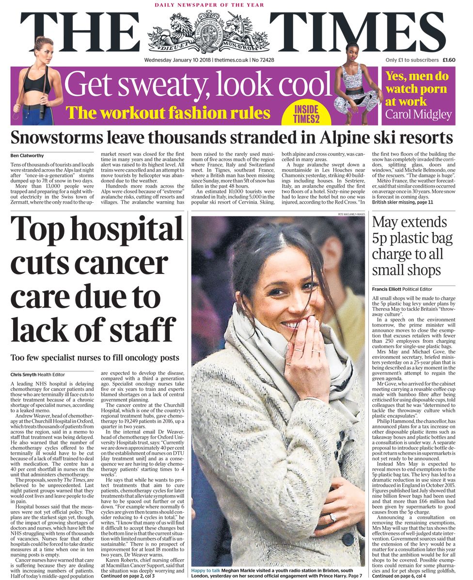
The Times - significant logo between the title symbolises politics and old history - little chnages have been made - shows target audience can be for the older generation and those interested in Brexit and other polititions. - statistics and figures - controversial topics such as cancer, Donald Trump
Daily Mail - Less text, therefore a large title covering over half of the front cover. - More colour - Inclusive - the poppy - symbolic - Spice Girls, a well known pop group that is likely to engage fans and those interested in celebrity gossip.
Metro - Newspapers such as the Daily Mail and Metro include something 'free' in order to make it more appealing to customers, so they want to purchase or read the article. - offers at the bottom of the page to show its unformal - it promotes deals and discounts. - minimal text
Daily Mirror - big story of a hate crime - celebrity drama of Ant and court - large title - advertising of a tv programme
Daily Star - offers and compares itself to The Sun on the front cover - '10p cheaper than The Sun' - celebrity stories - informal language - pun/word play - entertaining factors to engage the audience - bold/capital letters
The Sun - larger images than newspapers such as The Guardian and The Independent - uses less factual text - main focus on celebrities lives as opposed to the day to day people
Daily Express - large titles covering the front cover - presented as a lower social group newspaper - deals included - suggests the lower social classes also, so they can afford - not as educated to understand complex vocabulary
Representation notes
Representation
Definitions:Stereotypes
- media industries use stereotypes
- repeated so we think they are normal or true
Archetypes
- ultimate stereotypes e.g. white stiletto wearing, big busted, brainless blonde bimbos
Counter-type
- challenges tradition stereo-typically associations of groups, people/places
Representation: - the way in which people, events and ideas are presented to the audience
- the media takes something that is already there and represents it to us in the way that they choose. Media is rarely one hundred percent true.
- they are created by producers (anyone who makes a media text) of media texts.
- what they choose to present to us is controlled by gatekeepers.
“Gatekeepers” - any person involved in a media production with the power to make a decision about something the audience are allowed to.
DR CAGES
Disability
Regional identity
Class
Age
Gender
Ethnicity
Sexuality
Subscribe to:
Posts (Atom)